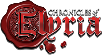


The main Chronicles of Elyria logo consists of the red wax seal with the name of the game written across the top.
The main logo is to be used across all primary brand applications, to help easily identify Chronicles of Elyria identity in print, media, and web, and to establish the brand in the gaming space. To maintain the brand’s integrity, the logo must be used with the correct intent and follow the brand guidelines below.
The full colored logo should be used for most branding usages.
Give the logo a clear space of ½ of the height of the wax seal.
On a white or light background use the logo with the black “Chronicles of” text, and on a black or dark background use the logo with the “Chronicles of” in white text.
The Chronicles of Elyria logo should always be featured as larger or equal sizes to other logos on the same page if it is listed in context with other games. The logo may come secondary to a logo for one of our products or towards a sponsorship if we choose to support a cause or event.
Print: 2/3” tall
Web: 50px tall
Mobile: 50px tall
For smaller sizes, use the Wax Seal icon for sizes as small as 30px tall.
The Chronicles of Elyria logo should always be readable size on print, web, and mobile, and should always follow the minimum size rules.
The logo should never be on a background color that will affect it’s readability.
Do not affect the logo’s aspect ratios by stretching or squashing the image.
Do not overlap the logo, and always respect the clear space as designated in the usage section.
Do not change the colors of the logo.
Do not add or subtract elements of the logo.
Do not skew the logo in any direction or turn the logo.
Do not add glows, outlines, or drop shadows to a logo.
Do not rearrange any of the elements on the logo, please use one of the pre-existing versions for the logo if you need any changes.
Hex: BB0303
CMYK: C-19%, M-100%, Y-100%, K-12%
RGB: R-182, G-3, B-3
Pantone: PANTONE 7626 C 144e77
Hex: 600000
CMYK: C-35%, M-98%, Y-95%, K-56%
RGB: R- 96, G-0, B-0
Pantone: PANTONE 1815 C
Hex: ABA299
CMYK: C-35%, M-32%, Y-37%, K-1%
RGB: R-171, G-162, B-153
Pantone: PANTONE Warm Gray 5 C
Hex: 352F2C
CMYK: C-65%, M- 64%, Y-65%, K-62%
RGB: R-53, G-47, B-44,
Pantone: PANTONE 440 C
Hex: C49530
CMYK: C-23%, M- 40%, Y-98%, K-3%
RGB: R-196, G-149, B-48,
Pantone: PANTONE 7556 C
Hex: 144E77
CMYK: C-97%, M- 71%, Y-31%, K-14%
RGB: R-20, G-78, B-119,
Pantone: PANTONE 7693 C
The font is Constantia for headings and subheadings.
Source Sans for headlines and subheadings, and body copy, as it is a clear and readable font. Depending on the usage, different font weights are acceptable.
El Messiri is for body copy.
The main Soulbound logo consists of the soul stone wrapped in flames with the company name blocked out below.
The main logo is to be used across all primary brand applications, to help easily identify Soulbound’s identity in print, media, and web, and to establish the brand in the gaming space. To maintain the brand’s integrity, the logo must be used with the correct intent and follow brand guidelines.
Use the full colored logo for most branding usage. It should be able to go on more backgrounds.
Give the logo a clear space of ¼ of the height of the soul stone.
On a white or light background with limited color, use the 2-color black logo, On a black or dark background with limited color, use the 2 color white logo.
When a one-color logo is needed, use the white logo on a black or dark background, or the black logo on white or light colored backgrounds.
The Soulbound logo should always be equal size or larger than other corporate logos, if they are displayed on the same page. The logo should never look diminished in comparison to other corporate logos.
The logo may come secondary to a logo for one of our products or towards a sponsorship if we choose to support a cause or event.
Print: 2/3” tall
Web: 50px tall
Mobile: 50px tall
For smaller sizes, use the Soulstone icon for sizes as small as 30px tall.
For banners of different aspect ratios, there is a horizontal and vertical version. These are suitable when limited color palettes are called for, or for when simpler logos are more beneficial such as web or mobile banners.
The Soulbound logo should always be readable size on print, web, and mobile, and should always follow the minimum size rules.
The logo should never be on a background color that will affect it’s readability.
Do not affect the logo’s aspect ratios by stretching or squashing the image.
Do not overlap the logo, and always respect the clear space as designated in the usage section.
Do not change the colors of the logo.
Do not add or subtract elements of the logo.
Do not skew the logo in any direction or turn the logo.
Do not add glows, outlines, or drop shadows to a logo.
Do not rearrange any of the elements on the logo, please use one of the pre-existing versions for the logo if you need any changes.
Hex: 4f8dda
CMYK: C-71%, M37%, Y-0%, K-0%
RGB: R-59, G-142, B-222
Pantone: 279 C (Solid Coat)
Hex: 233f61
CMYK: C-93%, M-76%, Y-38%, K-26%
RGB: R- 35, G-63, B-97
Pantone: 534 C (Solid Coat)
Hex: 015bc9
CMYK: C-88%, M-68%, Y-0%, K-0%
RGB: R-1, G-91, B-201
Pantone: 2726 C (Solid Coat)
Hex: 000000
CMYK: C-0%, M- 0%, Y-0%, k-100%
RGB: R-0, G-0, B-0,
Pantone: Black 6 (Solid Coat)
Hex: ffffff
CMYK: C-0%, M-0%, Y-0%, K-0%
RGB: R-255, G-255, B-255
Pantone: None
The font is Josefin Sans for body copy and subheadings.
Twentieth Century Bold for headlines and subheadings.